ShopDreamUp AI ArtDreamUp

Deviation Actions


![[14/30] - Nourishing](https://images-wixmp-ed30a86b8c4ca887773594c2.wixmp.com/f/3bdf1a63-9b6d-46b1-a040-e8cc834abb70/d8pa707-b235c669-9208-4c17-9a80-2dfcd3c8a3d7.jpg/v1/crop/w_184,h_184,x_0,y_0,scl_0.28307692307692,q_70,strp/_14_30____nourishing_by_sarah_bk_d8pa707-92s-2x.jpg?token=eyJ0eXAiOiJKV1QiLCJhbGciOiJIUzI1NiJ9.eyJzdWIiOiJ1cm46YXBwOjdlMGQxODg5ODIyNjQzNzNhNWYwZDQxNWVhMGQyNmUwIiwiaXNzIjoidXJuOmFwcDo3ZTBkMTg4OTgyMjY0MzczYTVmMGQ0MTVlYTBkMjZlMCIsIm9iaiI6W1t7ImhlaWdodCI6Ijw9NjUwIiwicGF0aCI6IlwvZlwvM2JkZjFhNjMtOWI2ZC00NmIxLWEwNDAtZThjYzgzNGFiYjcwXC9kOHBhNzA3LWIyMzVjNjY5LTkyMDgtNGMxNy05YTgwLTJkZmNkM2M4YTNkNy5qcGciLCJ3aWR0aCI6Ijw9NjUwIn1dXSwiYXVkIjpbInVybjpzZXJ2aWNlOmltYWdlLm9wZXJhdGlvbnMiXX0.RBbg1YuzMCw32i9neqbgXXeZ4GyMDUPGb65_o_ur2_4)
![[14/30] - Nourishing](https://images-wixmp-ed30a86b8c4ca887773594c2.wixmp.com/f/3bdf1a63-9b6d-46b1-a040-e8cc834abb70/d8pa707-b235c669-9208-4c17-9a80-2dfcd3c8a3d7.jpg/v1/crop/w_92,h_92,x_0,y_0,scl_0.14153846153846,q_70,strp/_14_30____nourishing_by_sarah_bk_d8pa707-92s.jpg?token=eyJ0eXAiOiJKV1QiLCJhbGciOiJIUzI1NiJ9.eyJzdWIiOiJ1cm46YXBwOjdlMGQxODg5ODIyNjQzNzNhNWYwZDQxNWVhMGQyNmUwIiwiaXNzIjoidXJuOmFwcDo3ZTBkMTg4OTgyMjY0MzczYTVmMGQ0MTVlYTBkMjZlMCIsIm9iaiI6W1t7ImhlaWdodCI6Ijw9NjUwIiwicGF0aCI6IlwvZlwvM2JkZjFhNjMtOWI2ZC00NmIxLWEwNDAtZThjYzgzNGFiYjcwXC9kOHBhNzA3LWIyMzVjNjY5LTkyMDgtNGMxNy05YTgwLTJkZmNkM2M4YTNkNy5qcGciLCJ3aWR0aCI6Ijw9NjUwIn1dXSwiYXVkIjpbInVybjpzZXJ2aWNlOmltYWdlLm9wZXJhdGlvbnMiXX0.RBbg1YuzMCw32i9neqbgXXeZ4GyMDUPGb65_o_ur2_4)


Description

Image size
3086x3086px 1.17 MB
Make
Canon
Model
Canon EOS 600D
Shutter Speed
1/1024 second
Aperture
F/5.6
Focal Length
300 mm
ISO Speed
800
Date Taken
May 6, 2013, 1:37:20 PM
Lens
EF70-300mm f/4-5.6 IS USM
Sensor Size
13mm
© 2013 - 2024 FreyaPhotos
Comments12
Join the community to add your comment. Already a deviant? Log In
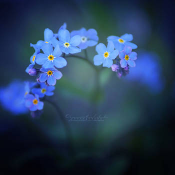
As soon as I saw the thumbnailI had to inspect the photo further. Now I've been staring at it plain for five minutes, trying to make my mind up about it. To work methodically, I might as well categorise my thoughts.
The Good:
The impact of this is without measure to any other depiction of a flower that has come before my eyes. The soft, velvet colours in the background and the few bright spots of yellow couldn't play the complimentary effect any better. There's a certain feeling to the background... It gently envelops the motif, like a supporting pillar. It reminds me of strength, but gentle care as well. A very mixed and complex thing to draw from looking at a flower, which is fragile but holds much beauty still.
Concerning the composition, I will have to tell you that it works well with the motif, even though I will not deem it original. Flowers have always been a sort of opaque object for photography. It can be really interesting, in level with the spiritualism we want to observe within the flower, or it can be plain lame. You did well in giving the flower life, despite of it's bright palette.
The Not-So-Good
The focus. I can't... I don't know if I like it for it's originality or if I think the f-range should be wider and more centred...
Another thing I know for sure that I would suggest you do differently another time, is the placement of your watermark. I know how difficult it is to make a smooth, matching signature, but oh boy the placement... I think most would agree that it should not be placed so that you can crop it, but nor should it disturb or interfere with what is actually going on in the picture. Next time, try to find a spot that is a little brighter and decently linear (either diagonal or up-n'down-linear).
Overall, I am considerably fond of this. I would dare hang it on my wall had it been my own. It bids me tranquillity, and I can stare thoughtlessly or wondering into this. I urge to give my compliments to you with this piece. Well done and keep beckoning your imagination to work with you =]